Open
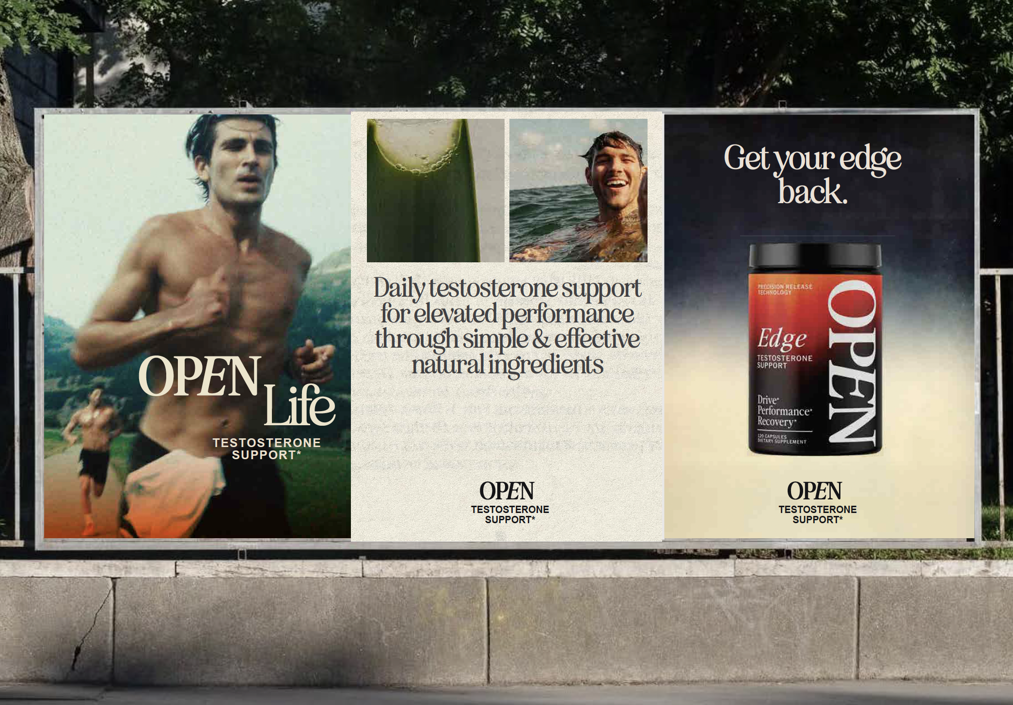
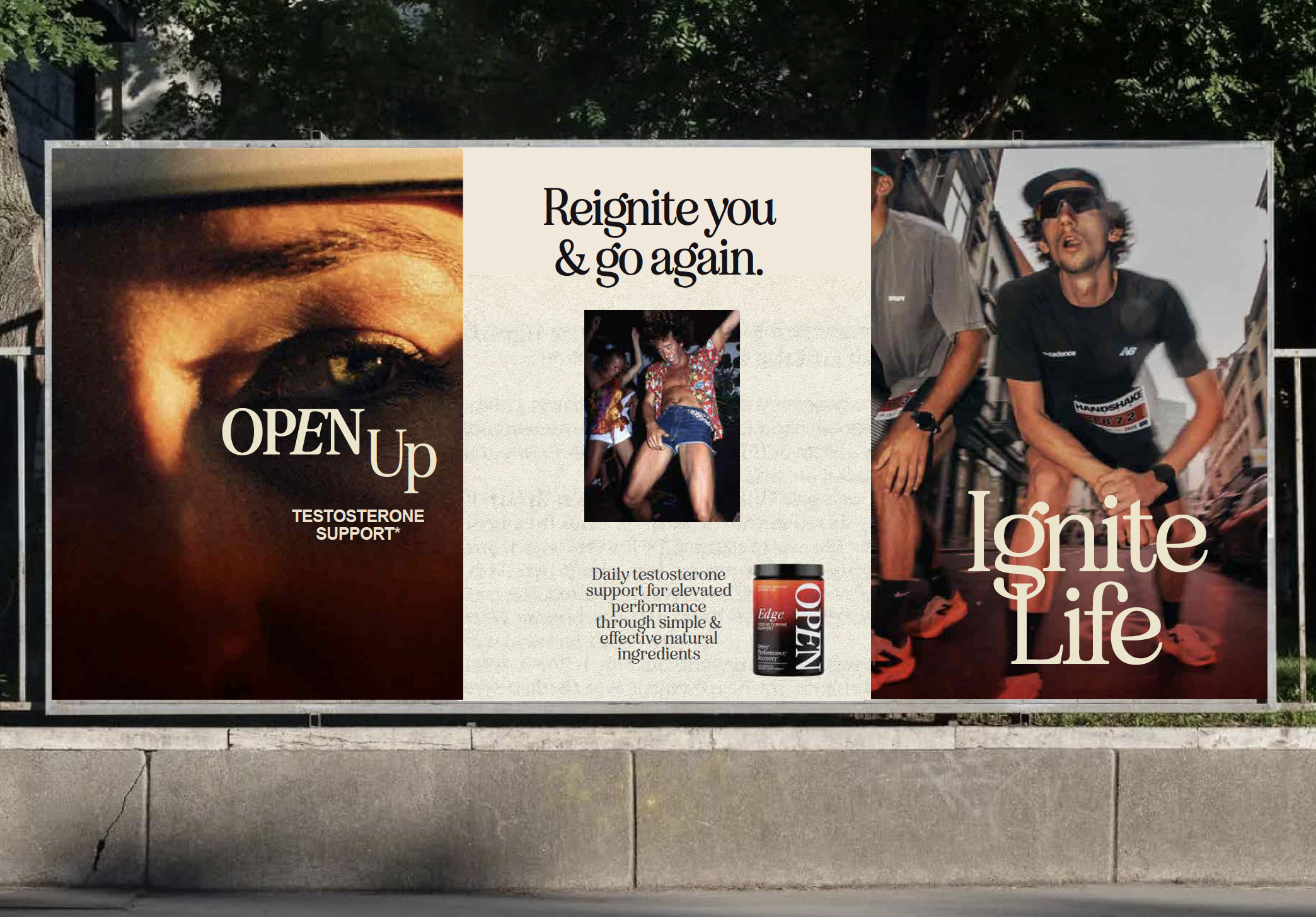
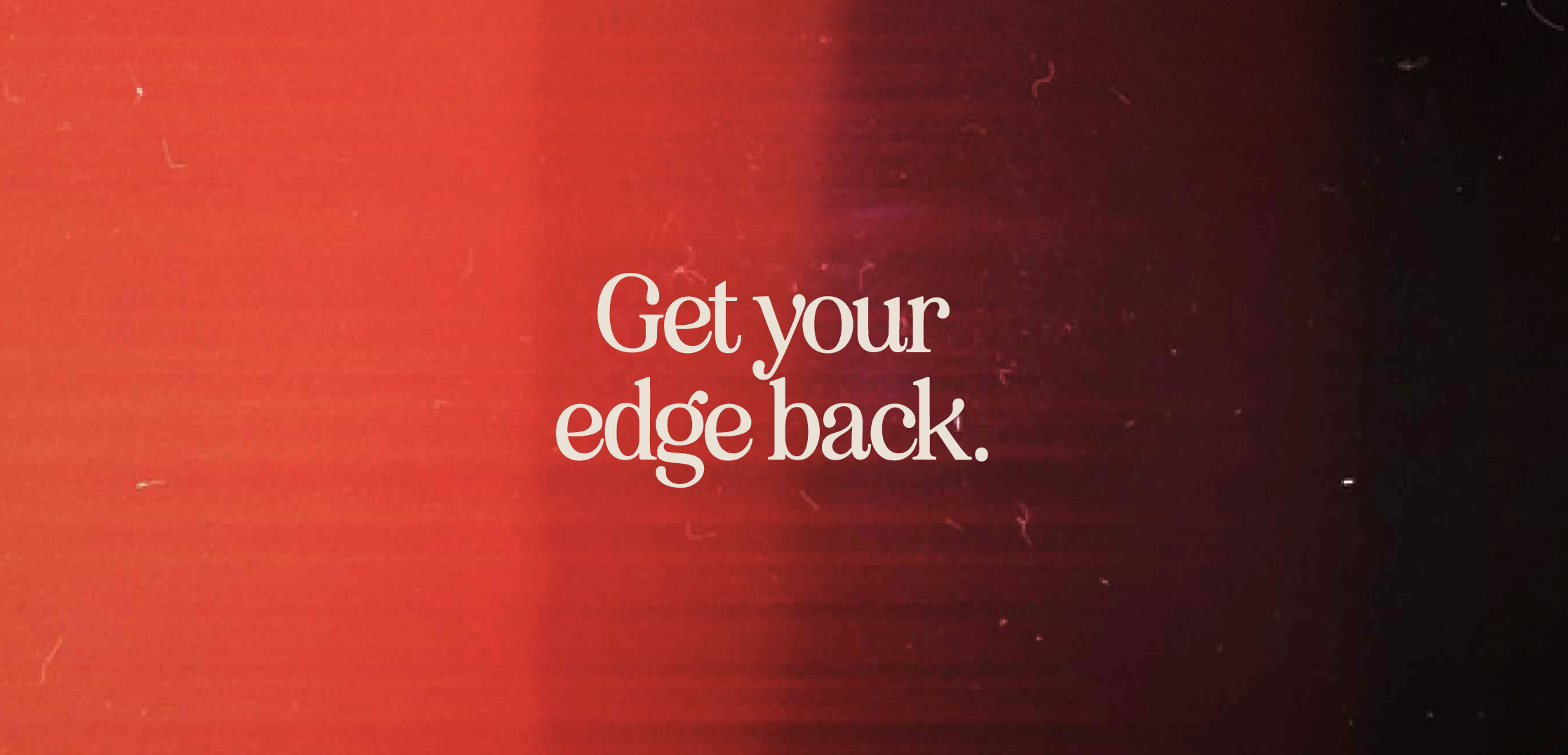
Through retro nostalgia you can almost touch, I gave Open its edge back.
Strangely familiar textures. Honest, unfiltered moments. I took the brand down a path of substance, away from overly polished fakery, and toward something that feels worth revisiting.
The visuals tug at the heartstrings, conjuring memories of boundless energy and optimism. Textured paper stock backgrounds faintly echo 80s magazine print reproduction. Granular gradients recall a time before AI, when photography felt raw, untouched, and human.
There’s a quiet halo of honesty in that imperfection.
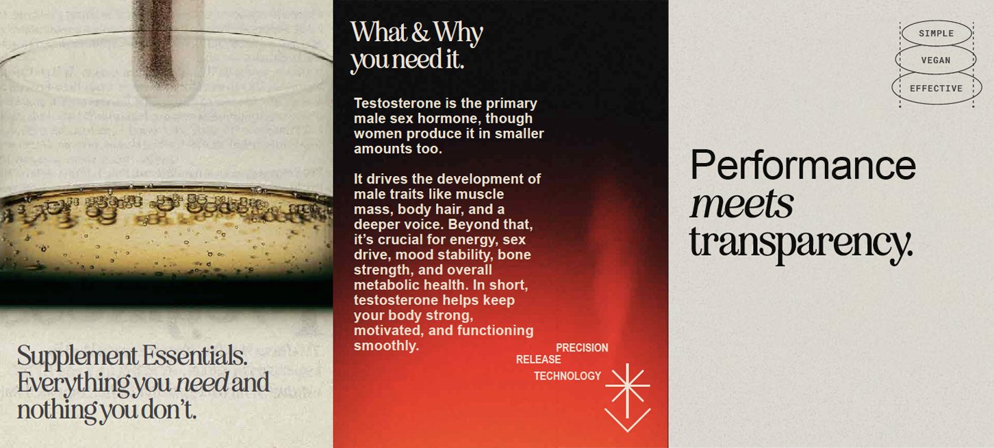
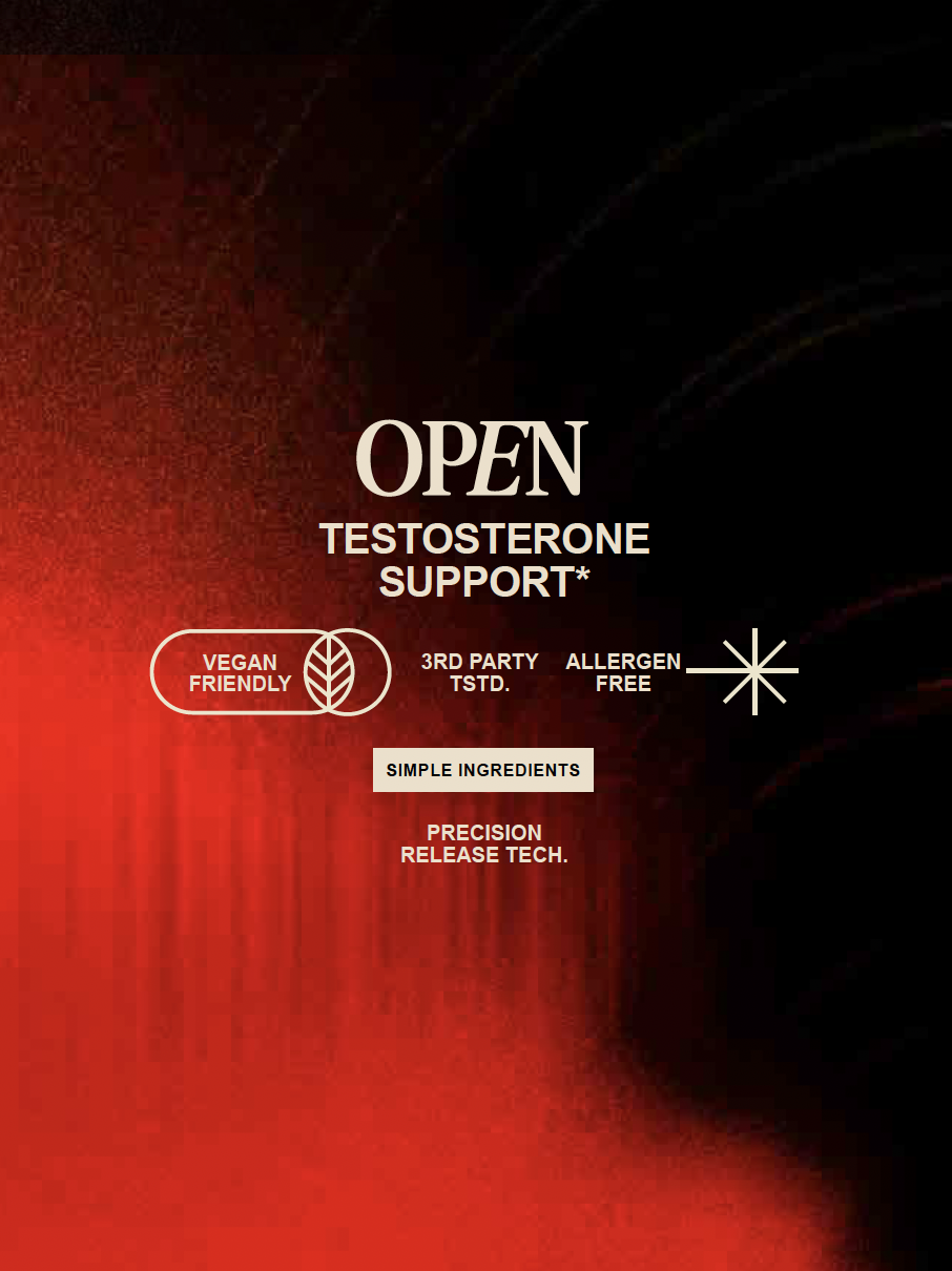
While much of the design feels like a keepsake magazine rediscovered in a basement box, bespoke technical diagrams cut through the nostalgia. They signal efficacy. Intelligence. A modern edge.
The result is a tension between sentiment and substance, a brand that feels both remembered and relevant.