
Over Easy
In the role as ECD I led the team of strategist, designers and illustrators to reposition this breakfast beater.
Die line Feature:
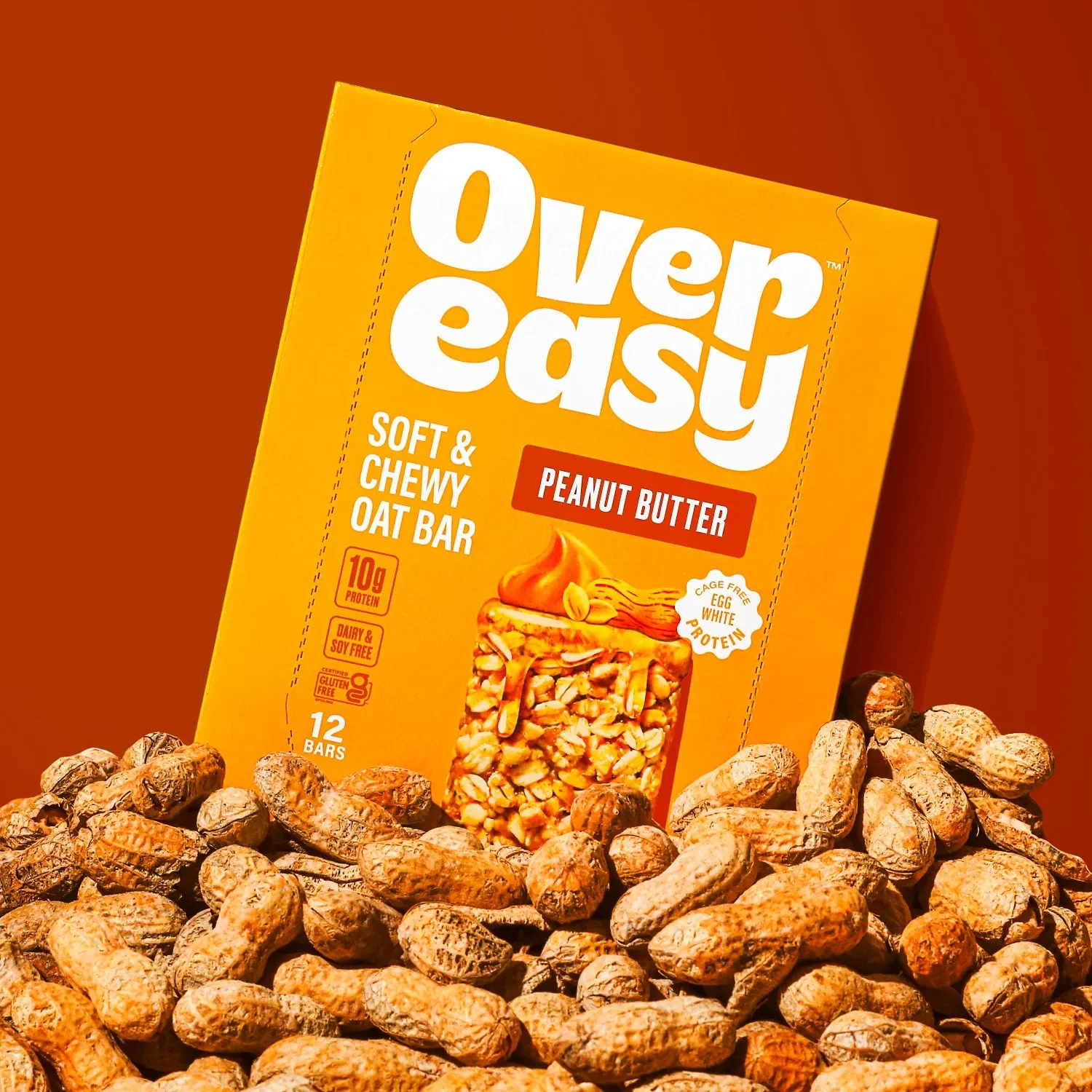
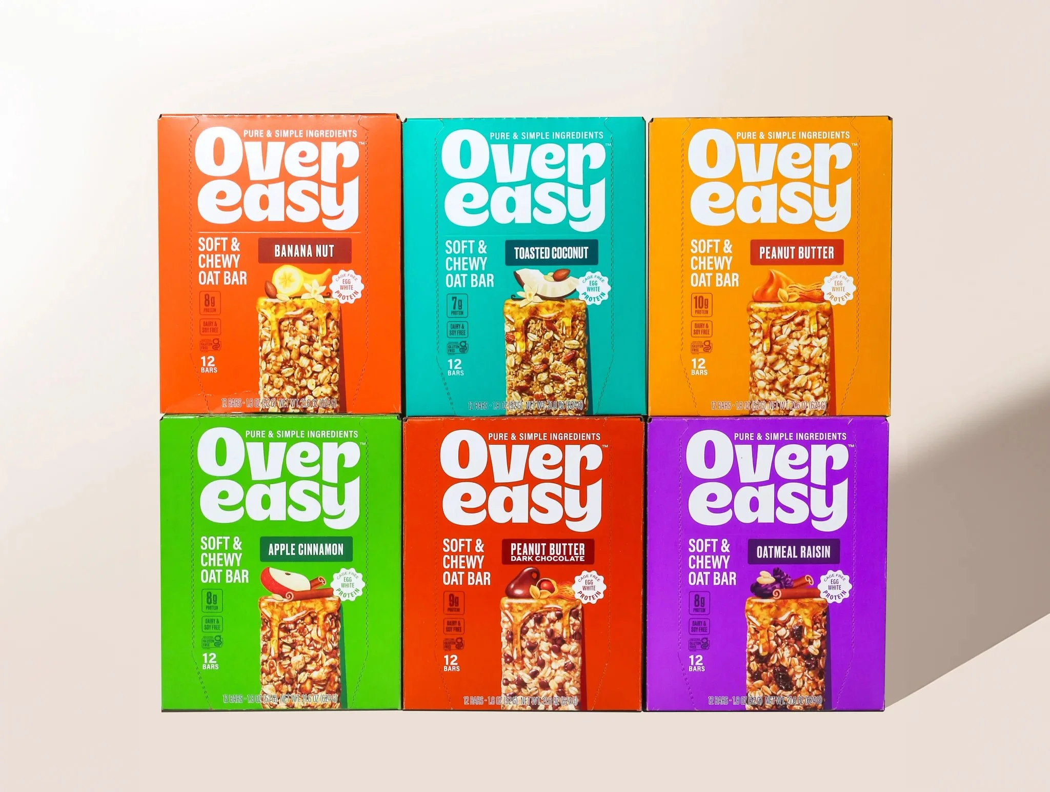
After a few years on the market as a niche breakfast bar company, Over Easy was ready for a rebrand to help them expand into mass retail and compete with ‘Big Breakfast’ as a nourishing, delicious, easy option for consumers at home or on the go. Over Easy needed a fresh visual identity that more clearly communicated what their product offerings actually are.
The goal was a design that showcases the oatmeal bars and supports a wholesome, uncomplicated ingredients storyline, while also delivering taste appeal to compete on shelf with established breakfast and protein bar brands. We took inspiration from the founding story of pure, simple ingredients to position the brand as the authentic, tasty option for consumers looking for all of the nutrition of a healthy breakfast with none of the hassle. Charming ingredient illustrations and bold colorways give the brand a bright, welcoming personality and flavor-forward appeal.


Over Easy came to Hatch to reposition and re-establish themselves as a healthy breakfast alternative. Leaning into taste and strong shelf presence.
As the Executive Creative Director I worked with the team from strategy through to the identity, which then ultimately resulted in a successful team effort, from system thinking to illustration - Sean Morse (DD), Dany Vo (SD) and Tracy Lee (SD). Case study art direction: Sean Morse
Brand and Packaging Design
Out of home visuals